Post production: Double spread
th
First step was setting up my canvas which I did according to my magazine
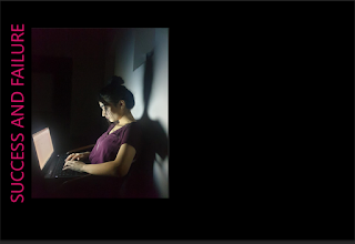
Next came the image
Next I added title
I went with this colour because it is the colour of food panda, I also wanted some contrasting colour with black and white.
I choose this font so it looks like a title
Next I added the stand first
At this stage, I started dividing my double spread into colums
I choose this font because it gives the impression, it is a saying; which it is
Then I added the subtitle and the by line
Next I added my article and divided it into two columns and divided the entire page into 4 columns
I choose the Arial font here as this was a paragraph, I kept the colour white so more attention is diverted towards the pink stand first
I added the foodpanda logo because it relates to the article
I forgot to add the drop cap so I added that at he very end
I realised at this point that the font was 15 so i changed that as well as the placement of the Stand first


Comments
Post a Comment